As many of you know, the iPhone Duo is my first ever iPhone. Because of that, I've had a massive adjustment to make just learning the operating system in general.
Before I even bought this device, I talked about how I wasn't sure if I was the right person to review the iPhone Duo for this exact reason. I really didn't want my review to just be all about the friction of adjusting to iOS. While a video about the friction of switching to iOS might make an interesting video, it would completely derail a review of this phone. It's a different topic entirely. I wanted to build something far more useful than that, a genuine review of the phone itself, not just a log of a long-term Android user using his first iPhone.
That is why, for this review, I'm using a slightly different format than I normally do. I've broken my thoughts down into five things I genuinely like and five things I dislike. Framing it this way helps keep the critique balanced and focuses squarely on where the hardware and software succeed or fail as a foldable, rather than just complaining about basic platform differences.
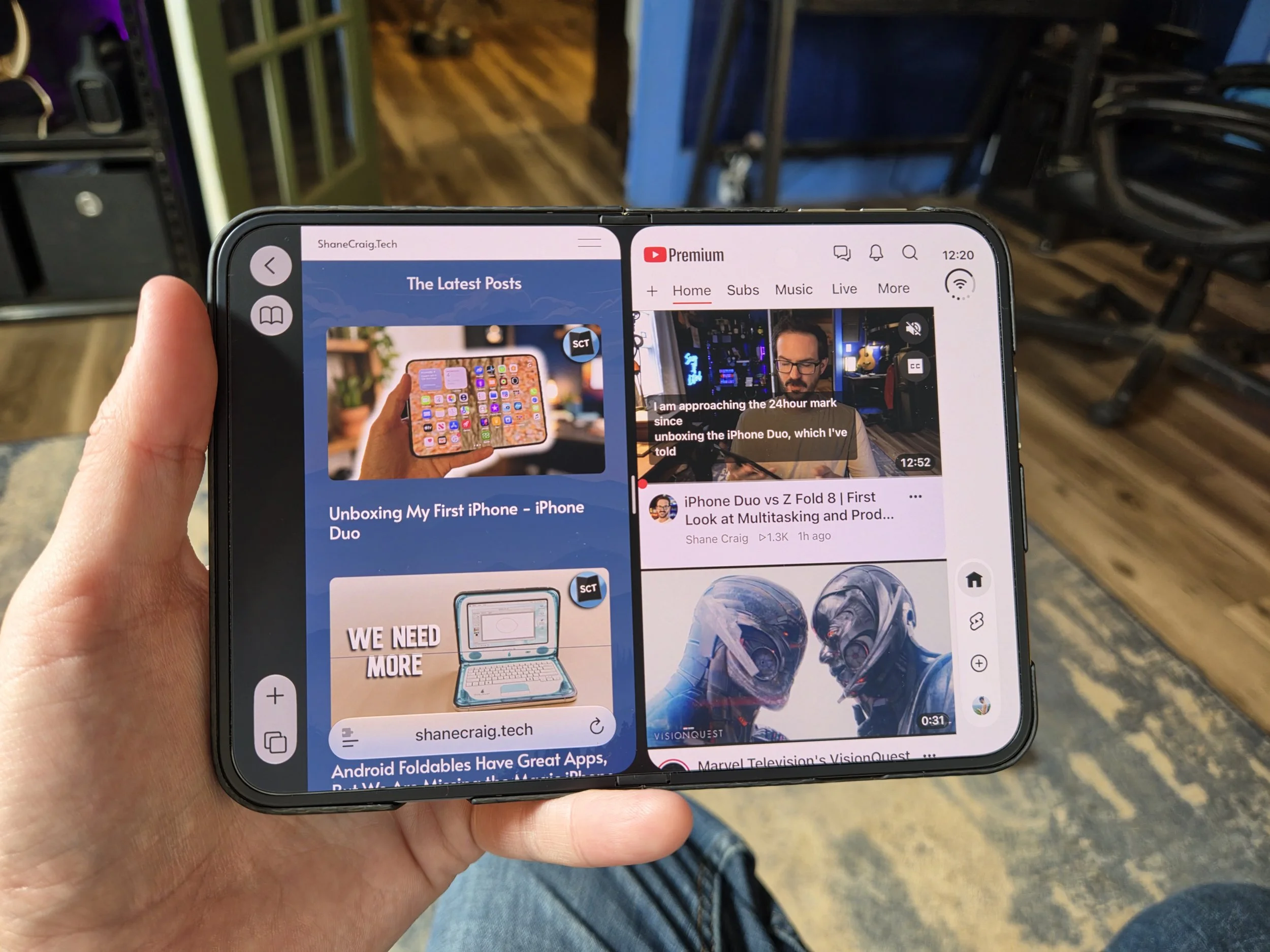
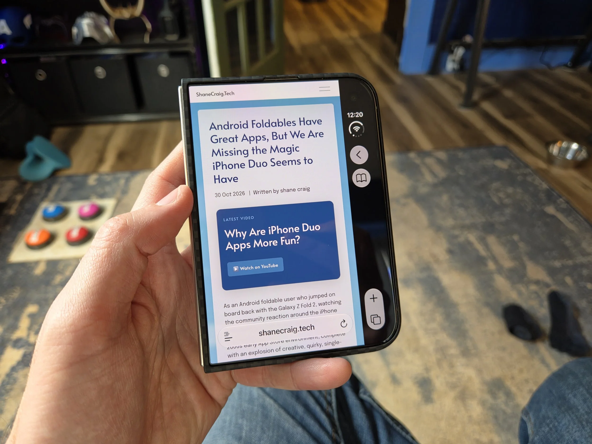
Dislike: Sidebar Space Sucking
To kick things off on the negative side, we're going to start by talking about that persistent vertical sidebar running down the right side of the display.
If you saw my initial reaction video when the iPhone Duo was first announced, you might remember me being pretty intrigued by this idea. Moving key UI elements and status icons over to the right edge seemed like a smart way to keep things within easy thumb reach for one-handed use on both screens. In practice, though, actually living with it every day completely changed my mind.
To understand why it feels so off, it helps to look at how Apple actually built this. Instead of a standard status bar across the top, they took all those indicators, compressed them into a single consolidated icon in the top right, and placed it inside a dedicated half-inch black bar running vertically down the right side of the screen.
Focusing first on the cover display, taking a full half-inch of horizontal space off the screen creates a host of issues in addition to simply looking weird. Most of the apps I've tested literally just show a massive black strip on the right edge with a lone status icon sitting at the top. A few apps have been updated to place actual app controls inside that bar, which is slightly better, but it still makes the cover display feel unnecessarily scrunched horizontally. Then there are apps that have been updated to flow content entirely underneath that right sidebar, but that creates the opposite problem, leaving UI controls floating directly on top of the app content itself.
Once you open up the device, things get a little better simply because you have so much extra screen real estate, but the execution is completely inconsistent. Apps like Safari ditch the sidebar entirely on the inner display, leaving the consolidated status icon in the top right, but pushing navigation controls to the very top. Meanwhile, apps like the App Store continue their approach from the cover display, letting content flow right underneath the icons on the side.
The biggest headache comes when you try to multitask. When you split screen two apps side by side, you often don't end up with just one black bar, you end up with two. Because the UI layout expects elements on that right edge for each window, you end up wasting roughly a full inch of horizontal real estate just to accommodate the bars while side-by-side.
Between the wasted screen space, the bizarre layout bugs, and the horizontal squishing, somewhere between one-third to one-half of the apps I use every day are noticeably worse on this phone than on any other foldable I own. It stands out as one of the most head-scratching UI decisions I've seen Apple make in a long time, coming across less like a thoughtful layout solution and more like an attempt at being different for the sake of being different.
Like: Rotate Before Use
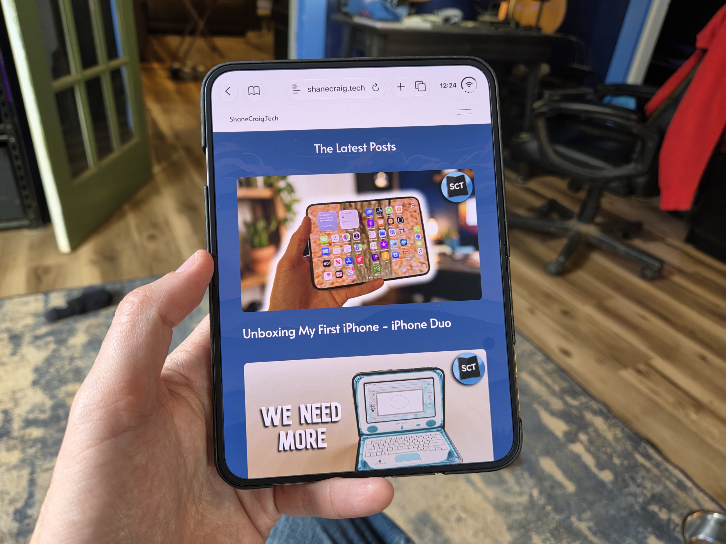
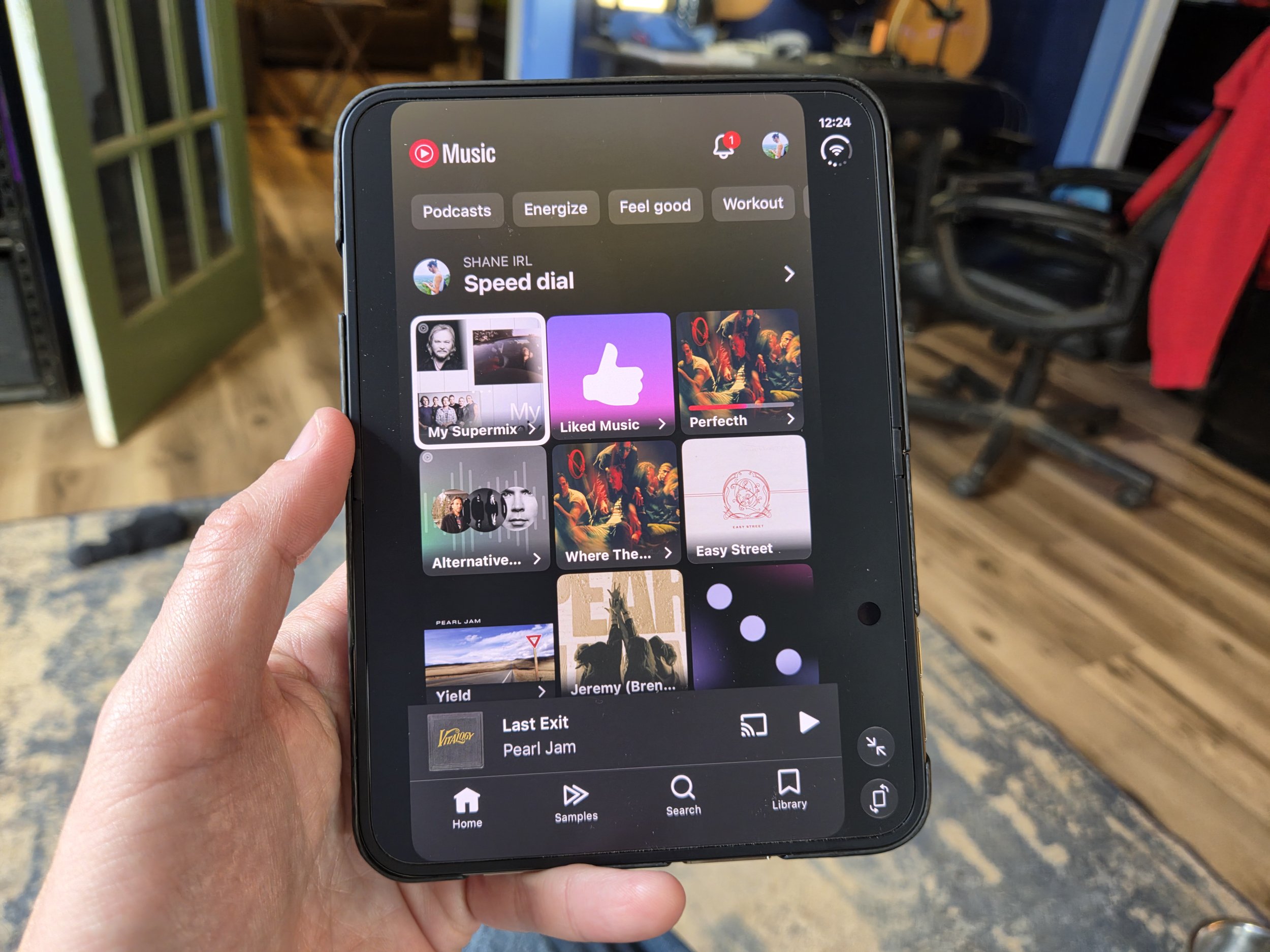
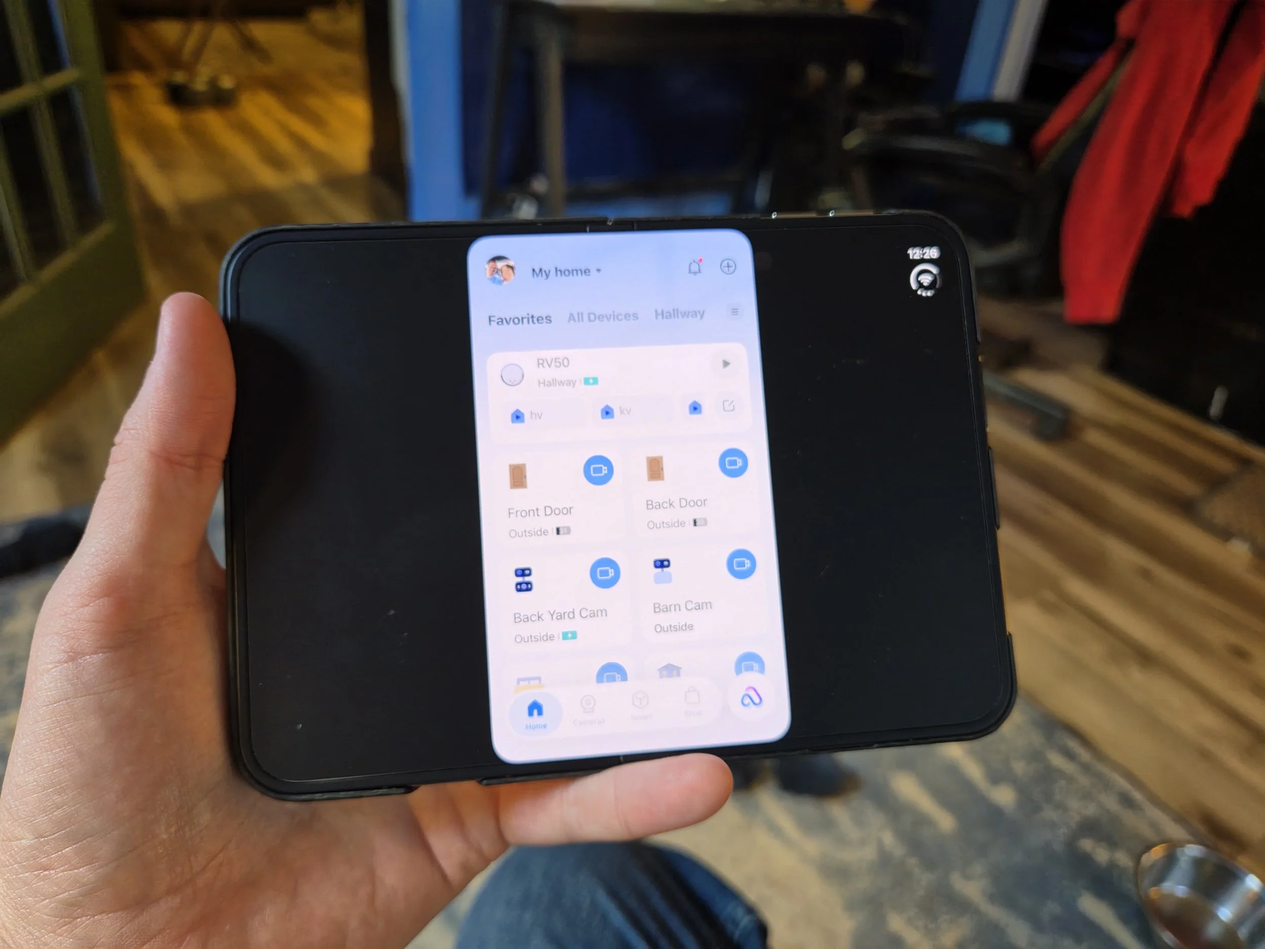
Flipping back over to the positive side, the single best way to use the iPhone Duo is to unfold the inner screen and rotate it into portrait orientation.
Part of what makes this rotated layout so satisfying is that it directly solves that frustrating vertical sidebar problem. Rotating the display takes that massive, persistent half-inch strip and shifts it up to the top edge where a traditional status bar naturally belongs. The sidebar effectively disappears into a top status area, instantly eliminating layout scrunching and letting apps render in a much more traditional aspect ratio.
Rotating an inner foldable display into portrait mode is already one of my favorite tricks on the Galaxy Z Fold 8, but on the iPhone Duo, it completely transforms the device. The software adapts surprisingly well, giving you massive vertical scrolling real estate for reading articles or feeds, all while getting that right-hand sidebar out of your way. If you own this phone, using it rotated in portrait mode is easily the most natural, immersive, and comfortable way to experience the hardware.
There is one big caveat to keep in mind, though. Everything I just described applies to applications that have actually been updated to support the iPhone Duo and stretch properly across the screen layout. If an app hasn't been updated to target the latest SDK, the experience isn't good, it's actually quite bad. Take my smart home app, Tapo, for example. Because it hasn't been updated, rotating the phone doesn't give you a rich, adaptive view, it literally just takes the standard cover display layout and blows it up. You end up stuck with the vertical sidebar on the right side, paired with a giant, empty black bar on the left side. When apps support the updated scaling, rotated portrait is fantastic, but when they don't, it quickly highlights how unoptimized un-updated software still is on this form factor.
And don't even get me started on what unsupported apps look like when you don't rotate the device.
Dislike: Typing Headaches
Overall text entry on the iPhone Duo has been a constant source of daily friction. On a screen layout where typing already requires some physical recalibration, the software keyboard isn't doing me any favors. The virtual layout feels surprisingly inconsistent, with the period key appearing or disappearing depending on which app context I'm typing in. That leaves me constantly relying on double-tapping space just to drop in a period, while basic punctuation like the comma remains buried behind the symbols menu unless I manually shift modes.
Things get even worse when I lean on voice input. Dictation on this device feels flat-out terrible, especially coming over from Android where speech-to-text with Gboard or tools like Rambler on my Googlebook is exceptionally reliable. On the iPhone Duo, dictation routinely misinterprets my natural pauses, inserts wrong punctuation out of nowhere, randomly capitalizes words right in the middle of my sentences, or misses basic punctuation entirely.
When I combine a frustrating, context-shifting virtual keyboard with unreliable voice dictation, basic daily tasks like drafting messages or taking quick notes end up taking me twice as long as they should. Text input is such a foundational element of any mobile operating system, so having this much friction on a premium device is a tough pill to swallow.
Like: Surface Duo Inspired
The split-screen multitasking implementation on the iPhone Duo gets a lot right. The gesture to trigger split screen is fast and intuitive, but the real highlight for me is how genuinely independent the dual workspaces feel once you have two apps open side by side.
If I have two apps running concurrently and I swipe up on one, it doesn't interrupt the other. It simply closes that single app and returns me to the home screen on that specific half of the display, leaving the second app completely untouched. It immediately brought back memories of using the Surface Duo, where each screen acted as its own distinct environment. That level of isolation between windows makes juggling two tasks feel seamless.
It's worth noting that it is missing some of the higher-end power-user features found on Android foldables, like floating pop-up window views or a desktop interface like Samsung DeX. But for a simple dual-app workflow, this specific gesture system is easily one of the most polished parts of the software.
Dislike: Muscle Memory Mishaps
This is a classic case of a feature sounding great in theory, but completely falling apart in practice. When you close the iPhone Duo, it doesn't lock the phone. If you're using the outer screen, open it up, and then close it again, iOS just seamlessly hands the display back to the outer cover screen.
The problem is that after a half decade of using foldables, muscle memory is a powerful thing. On virtually every Android foldable, closing the device either locks it immediately or, at minimum, gives you a swipe-up prompt if you actually want to continue using the cover display. With the iPhone Duo, closing the phone does not signal to the OS that you are done using it.
Because of this behavior, I can't tell you how many times I've shut the phone and slipped it into my pocket, assuming it was locked and put away, only to realize later that it was still awake and active the entire time. You have to force yourself to explicitly hit the power button every single time you close it, which turns a standard physical habit into an annoying extra step.
Like: Nano-Texture Triumphs
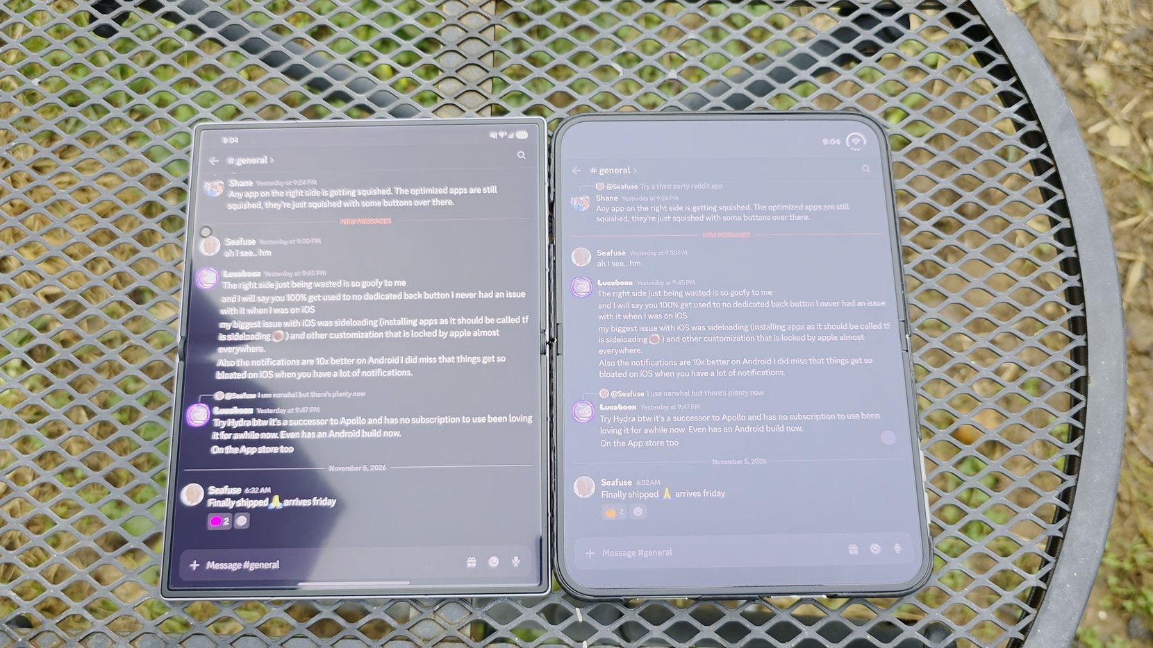
The nano-texture glass display on the iPhone Duo is a net win overall. One of the biggest complaints with foldable screens has always been the reflective plastic look and how distracting reflections can be, but this coating makes a noticeable difference. While the crease here is already pretty subtle on its own, the matte finish helps scatter light so you barely notice it in daily use, while completely eliminating sharp glare under overhead lighting.
Crucially, it also solves one of my biggest daily pet peeves with foldable devices: fingerprints and smudges. Standard foldable displays are absolute grease magnets that require constant wiping, but the nano-texture finish does a fantastic job mitigating oil buildup and keeping the screen looking clean.
It is not without a slight trade-off, as it can somewhat wash out colors and deep contrast in extremely bright ambient light. But when I weigh that minor downside against glare elimination, crease reduction, and freedom from constant fingerprint smudges, it's easily one of the best hardware decisions Apple made with this phone.
Dislike: I Just Want to Go Back
I know I said at the start of this review that I wouldn’t turn this into a generic list of my personal grievances with iOS and would strictly stick to Duo-specific hardware and software quirks. But the back navigation situation on this phone stood out to me so much during testing that I’m breaking my own rule, because I absolutely could not leave it out.
Coming over from Android, where a thumb swipe from either edge of the screen reliably takes me back no matter where I am, the navigation here feels like a chaotic step backward. On iOS, back swipes are strictly restricted to the left edge, which makes one-handed use awkwardly difficult when holding a wider device with my right hand.
What makes it even more infuriating is how completely unpredictable the targets feel across different apps. Sometimes a left-edge swipe works, but other times I'm forced to reach all the way up to tap a tiny back arrow in the top-left corner, an arrow placed in the top-right corner, or an "X" close button in a completely different spot.
Even within a single first-party app like the App Store, the navigation logic feels scattered depending on whether I'm looking at a search view or a detail page. Instead of relying on muscle memory, I'm constantly playing a game of hunt-and-peck just to figure out how to close a screen or return to the previous page.
Like: Consistent Camera Captures






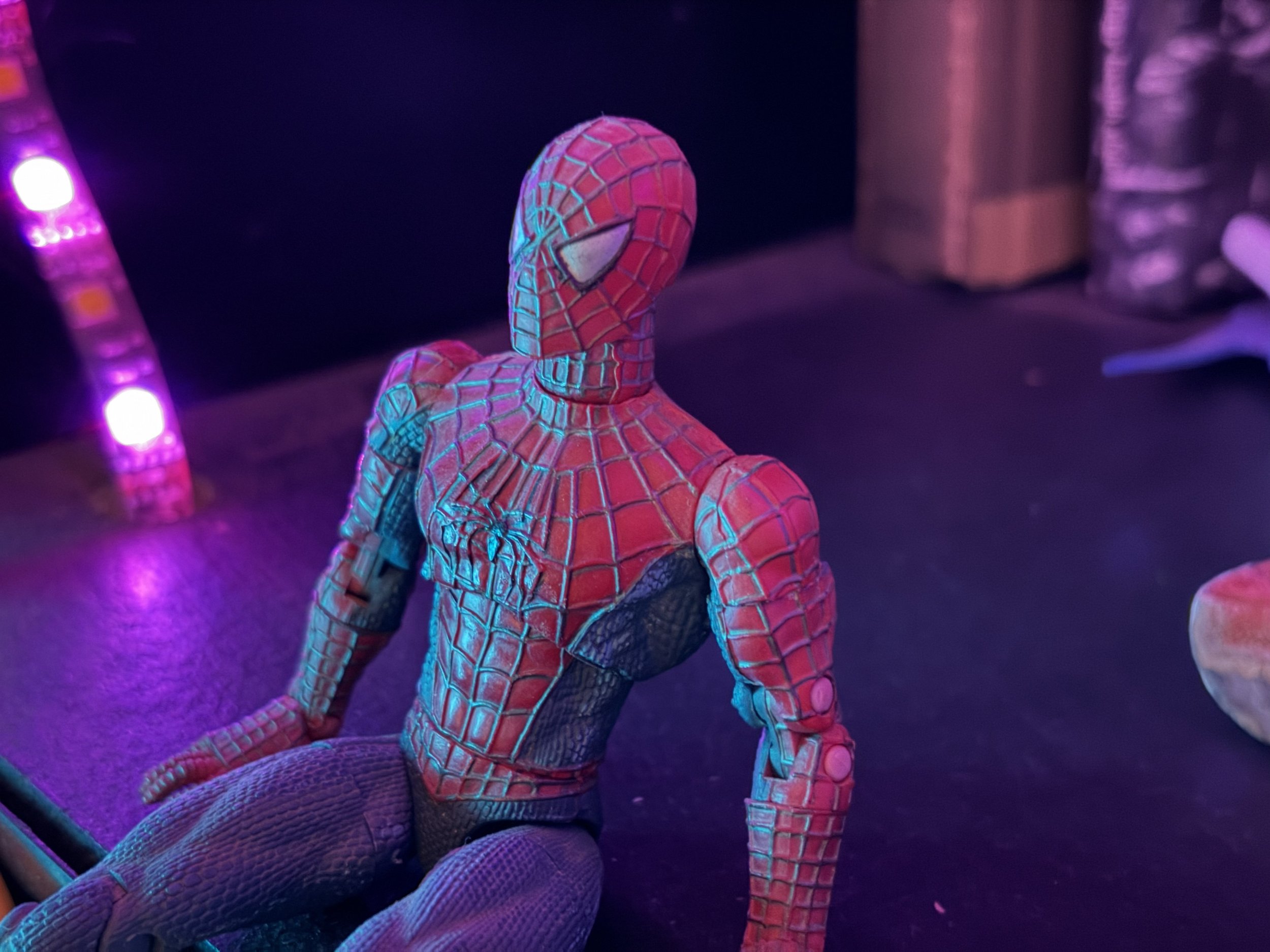
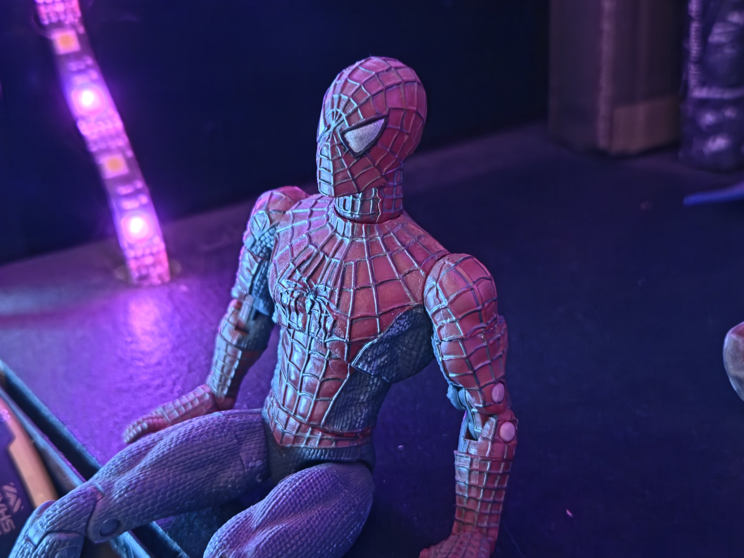
To be clear, this is not the absolute best camera system I've ever used on a foldable. That crown still belongs to the Honor Magic V6, which pretty much crushes this phone across the board when it comes to hardware specs and raw versatility. But for what it is, the camera setup on the iPhone Duo is solidly dependable.
Still photos capture impressive detail with color processing that leans heavily toward natural, true-to-life tones, which is a welcome shift compared to my Z Fold 8, which always pushes a slightly oversaturated look. Video performance is equally reliable, giving you smooth stabilization and clean highlights without over-processing. It might not set a new benchmark for foldable photography, but it delivers consistent, high-quality results every time you launch the camera.
Dislike: Buggier Than My First App
I have been quite surprised as to how buggy and unfinished this operating system feels. On one occasion, I swiped down to use universal search, and the keyboard basically lost its mind. Key presses were not logging at all, then suddenly the entire backlog of keys I had tried to type filled in all at once, the backspace key completely stopped working, and hitting one key would register as a key press on an entirely different key. Logging into PayPal was just as frustrating, leaving the entire screen completely blurred out and unresponsive.
The stability issues keep piling up across basic daily apps. WeatherWise has crashed several times, refusing to stay open for more than a couple of seconds at a time. To top it off, Shopify Collabs is completely inaccessible to me because when I tried to enter my verification code, the button to accept it simply did not respond no matter how many times I tapped it. For a platform that usually prides itself on software polish, using this phone right now feels like running an early developer beta.
Like: Proper Stereo Sound
The speaker setup on the iPhone Duo is surprisingly impressive for a first-generation foldable. By placing the speaker grilles offset at the top-left and bottom-right, Apple ensured proper stereo separation regardless of how you hold the device or whether you're using it open or closed. Output gets plenty loud without distorting, but more importantly, the sound profile is remarkably full and balanced across videos, podcasts, and music.
Conclusion
As an iPhone outsider, I need to make it clear that a huge chunk of what makes or breaks a phone like this comes down to subjective preference and muscle memory. Coming from continuous Android use going back to the original HTC Evo without ever daily-driving an iPhone, jumping into iOS means running up against entirely different platform philosophies. The quirks or layout decisions that drive me crazy as an Android veteran might feel completely normal to someone who has lived in Apple's ecosystem for years, just as an iOS user switching to Android would run into the exact same irritation in reverse. Throughout this review, I tried my best to separate those personal adjustment hurdles from actual product flaws, even though it was hard. You have no idea how many notifications I have missed using this thing.
As a piece of hardware, the iPhone Duo feels like a solid, premium device. Both of the screens look nice, the speakers sound good, and camera performance is exactly what you would expect. It's all very solid. However, on the software side of things, I can't help shaking the feeling that I have just reviewed my second incomplete-feeling product of the last few months, right alongside the Googlebook. The level of app incompatibility, the number of crashes I've experienced, and the sheer volume of weird glitches are impossible to overlook. It's not an exaggeration to say I've had more noticeable glitches in a week with this thing than I have had in three or four months with the Galaxy Z Fold 8. And before I hear the cries of 'it’s the developers' fault, not Apple’s,' Apple is the one who made such sweeping UI changes which necessitate the developers' extra work. They’re both at fault here. On the Android side, developers and Google have been taking it on the chin from the internet for years, Apple can handle their fair share now.
I never want to review a product for what it might become down the road, so I have to be honest about what it is right now. But I do think there is a safe expectation that many of these issues will get ironed out over time, app compatibility will improve, and the daily bugs and crashes will get cleaned up. For most people, the safest play is to wait this thing out, give it six months, and see where the software stands then. If you are a big Apple fan and you've wanted a foldable, this is the device you've been waiting for. But for me, by the end of this review period, I couldn't wait to go back to my Z Fold 8.