iPhone Duo Multitasking Early Comparison
The unveiling of the iPhone Duo has been out for a few weeks now, and while Apple showed off a lot of interesting features during the reveal, there is one specific element that keeps pulling my focus back: multitasking.
More specifically, it is how strikingly similar Apple's approach to multitasking is to a device that was extremely near and dear to my heart, a device that ironically shares the exact same name: the Microsoft Surface Duo.
For anyone who might not remember, the original Surface Duo was a fascinating piece of tech launched around the same time as the Galaxy Z Fold 2. Instead of using a single continuous folding screen, Microsoft opted for two distinct displays connected by a 360-degree hinge, effectively giving you a pocket-sized dual-monitor setup. The way Microsoft designed software interactions for those dual screens was incredibly intuitive, and watching the iPhone Duo in action feels like a total blast from the past.
A Familiar Gesture and Home Screen Integration
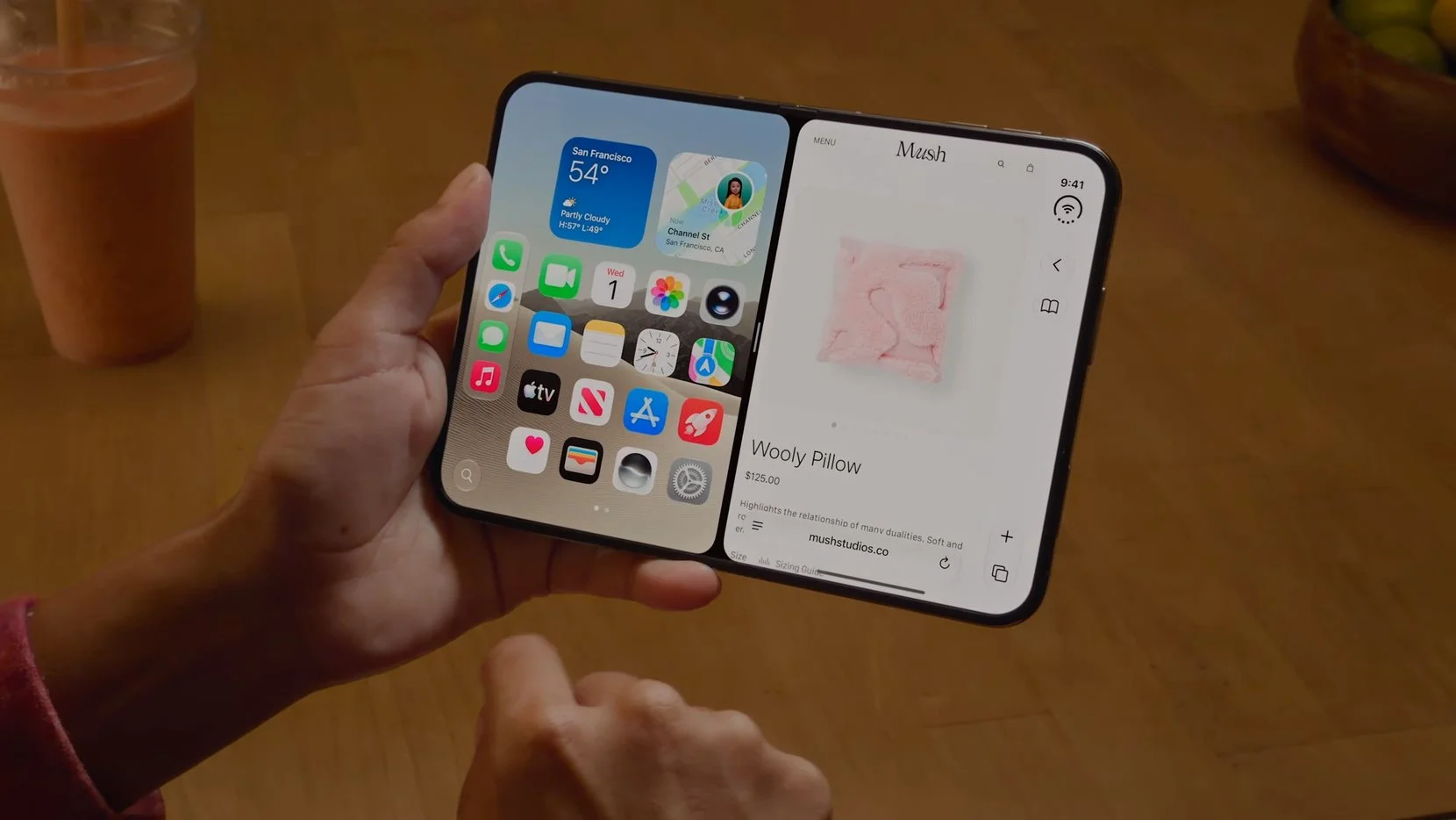

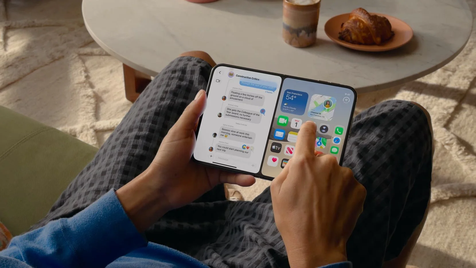
When you look at how the iPhone Duo handles split-screen multitasking, the interaction loop feels instantly recognizable.
To enter split-screen mode from a full-screen application, you swipe up and toward the left side of the display. This gesture throws the active app onto the left half of the screen and immediately reveals your standard home screen on the right.
This design choice is a massive win for usability because it lets your muscle memory take over. Instead of forcing you into a generic, text-heavy app list or an unfamiliar application drawer, you are looking directly at your familiar home screen icons. You already know where everything is, so launching your second app happens almost instantly without looking.
On the original Surface Duo, launching a second app worked on a very similar principle. When you had two applications open side-by-side and swiped up on one to dismiss it, the phone did not kick you all the way out to a blank state or close both windows. It simply cleared that single app and revealed your home screen underneath it, letting you swap in a new application effortlessly.
Seeing the iPhone Duo use that exact same mental model, where each half of the display can act as its own independent workspace revealing the home screen behind it, feels straight out of Microsoft's playbook.
How It Compares to Modern Foldables
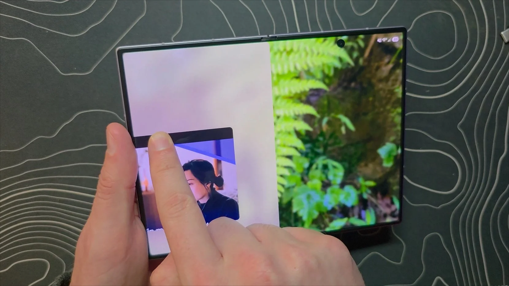
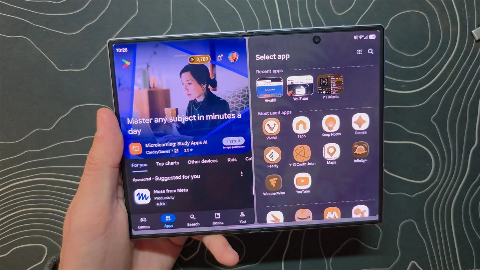
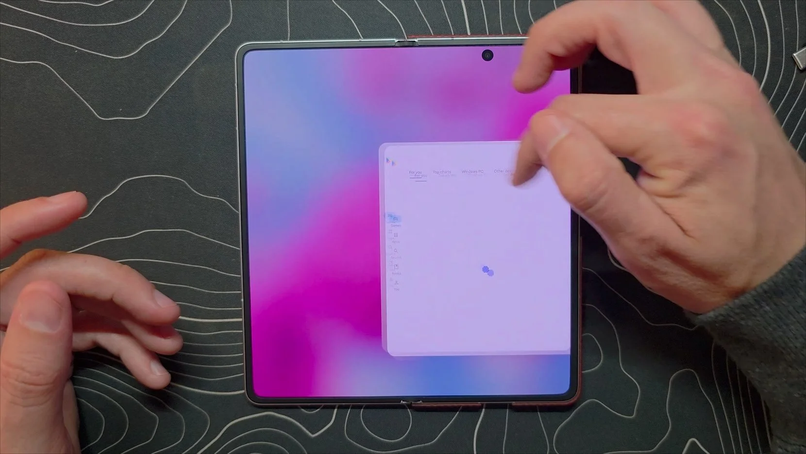
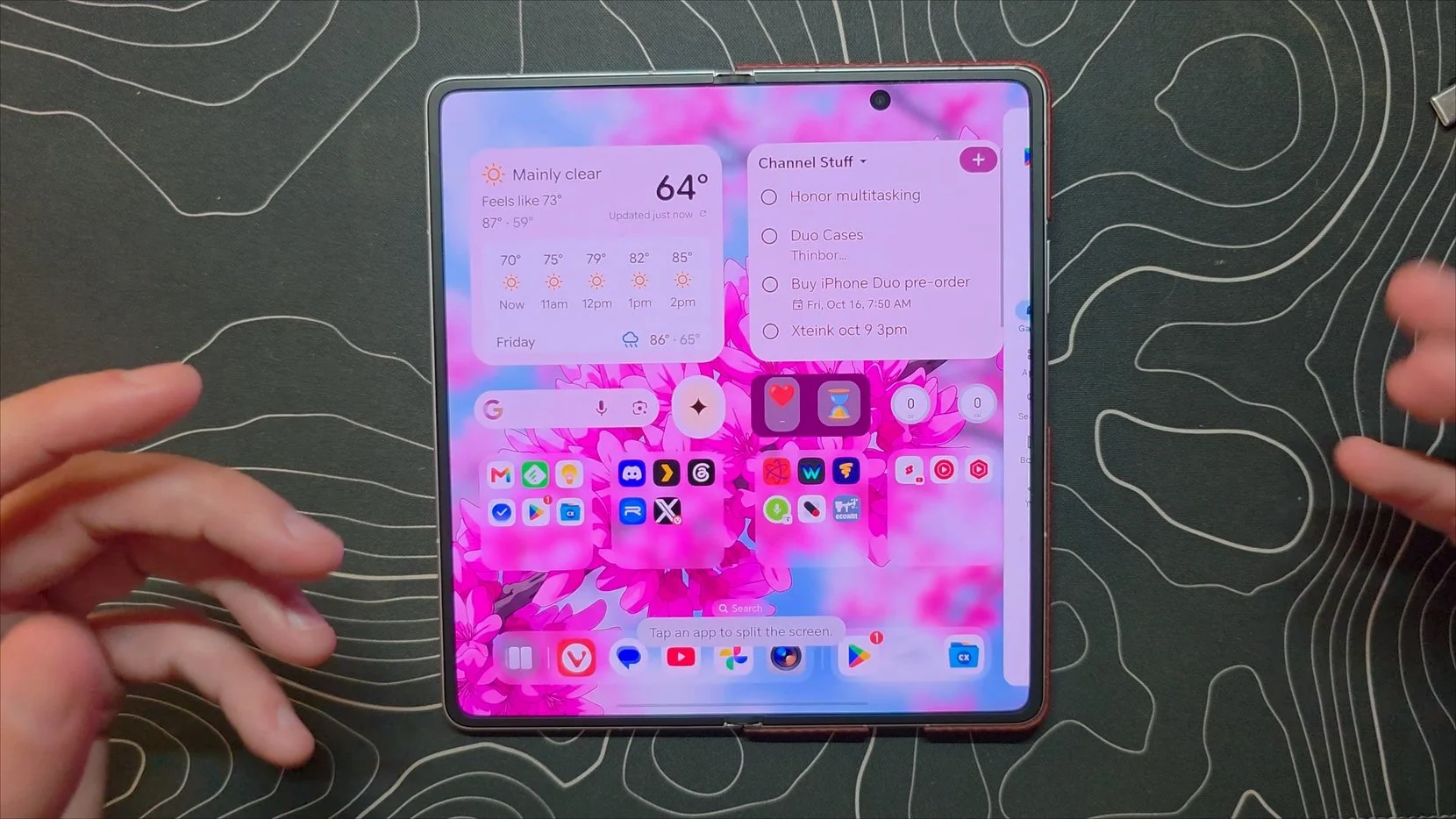
To appreciate why this design choice is so unique, you have to look at how mainstream foldables like the Samsung Galaxy Z Fold 8 or the Honor Magic V6 handle multi-window workflows.
On a Galaxy Z Fold 8, launching two apps side-by-side is easy and there are several options like the taskbar, but if you want to swap one out, Samsung defaults to showing you an alphabetical app list rather than your actual home screen. More importantly, if you use the standard swipe-up gesture from the bottom of the display on most Android foldables, the system closes both running applications at once and takes you entirely home. They treat the folding inner display as one single workspace split into two, rather than two separate, independent workspaces operating side-by-side.
Devices like the Honor Magic V6 do offer slick mechanics, like letting you grab a window handle and flick an app completely off-screen to clear it, but swiping home still dismisses everything simultaneously. The Surface Duo and the new iPhone Duo stand almost alone in treating each half of the screen as a truly isolated environment.
Apple Copied the Good, But Also the Bad
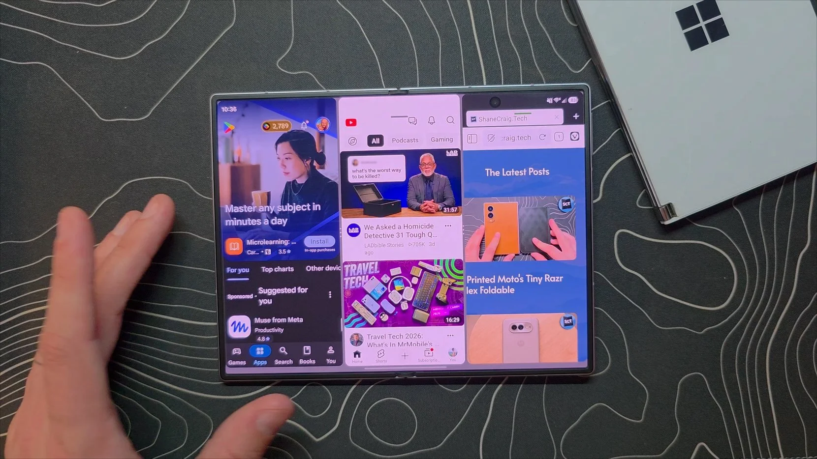
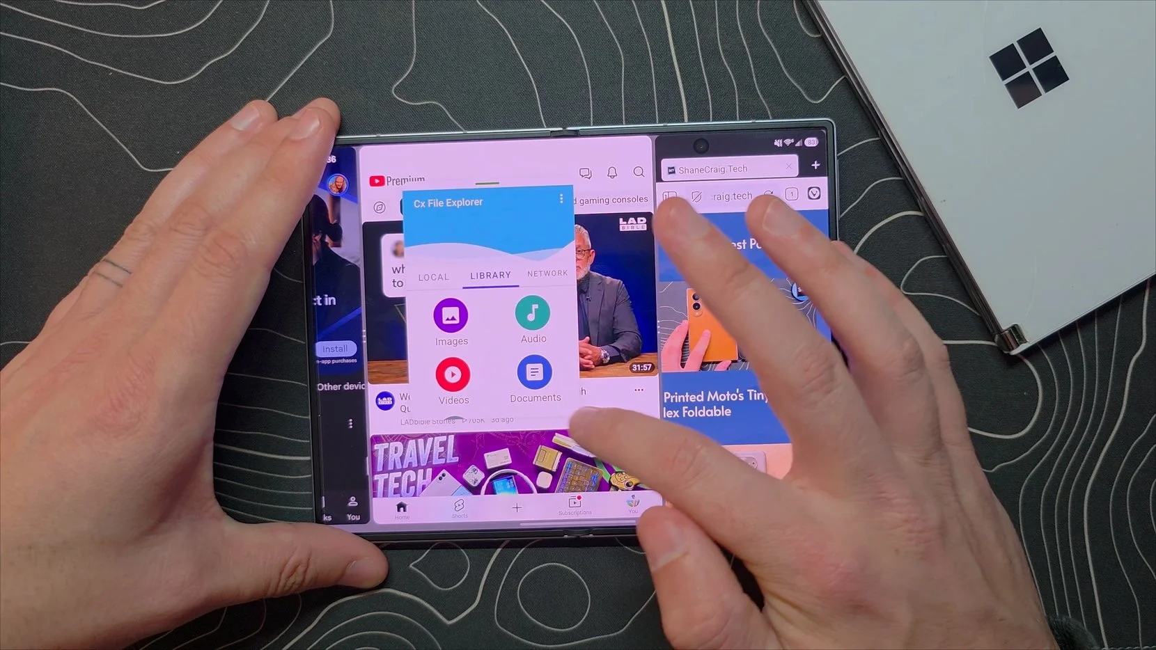
While Apple deserves credit for choosing logical gestures and treating dual apps as independent workspaces, they also appear to have adopted some of the original Surface Duo's software limitations.
From what has been shown so far, the iPhone Duo restricts multitasking to just two applications on screen at a time. There is no native support for a third side-by-side window, nor can you float extra applications on top in freeform pop-up windows.
By comparison, modern Android foldables are absolute multitasking powerhouses. On a Z Fold 8, you can comfortably run three apps in a split grid and still stack multiple floating, resizable pop-up windows over the top, minimizing them into floating icons when you need them out of the way. If you need extreme multi-app productivity, Android still holds a massive lead over what Apple is offering here.
Final Thoughts
Despite those limitations, it is genuinely wild to watch a phone named Duo launch five or six years after Microsoft's attempt and use the exact same fundamental concepts for handling multi-window software.
In fact, back when Microsoft was experimenting with early prototypes for the unreleased Surface Duo 3, which was planned to ditch the dual-panel design for a single folding OLED screen, the software interactions they were testing on a continuous display looked almost identical to what Apple has delivered with the iPhone Duo.
It proves that Microsoft was onto something truly special with their core multitasking logic, even if the hardware execution was ahead of its time. I am planning on picking up an iPhone Duo to test out as a primary device, and I am really looking forward to seeing how these gestures hold up in daily use.