One UI 8.5 Galaxy Z Fold 7 Review
I’ve been running the One UI 8.5 Beta on my Galaxy Z Fold 7 for a little over two weeks now. After living with it as my daily driver, the overall experience has been pretty positive. While "point updates" are often just minor bug fixes, this beta brings some substantial visual and functional changes that specifically make the Fold's large display feel more useful.
The first thing I noticed is that the software feels more "fluid" than the previous version. Samsung has clearly put work into the animation engine, making transitions feel smoother when unfolding the device or jumping between apps. Samsung still has their own identity here with their animations mostly having their own feel. Pixel’s are a bit bouncier and my Honor phones have a lot more “flourish” if that makes any sense. Samsung clearly wants you to see the animations, but they’re still happy to get out of the way relatively fast.
Floating Panels
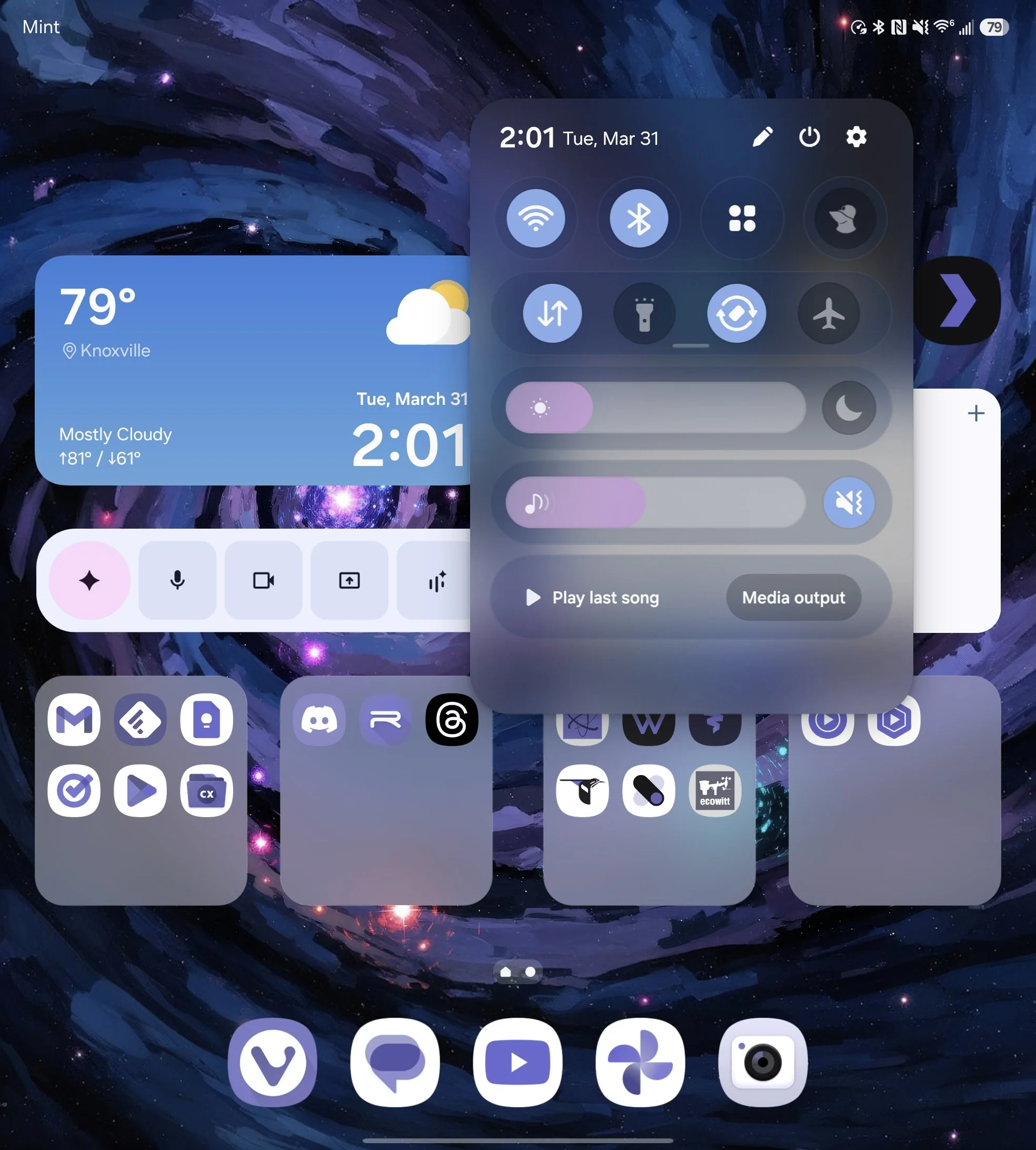
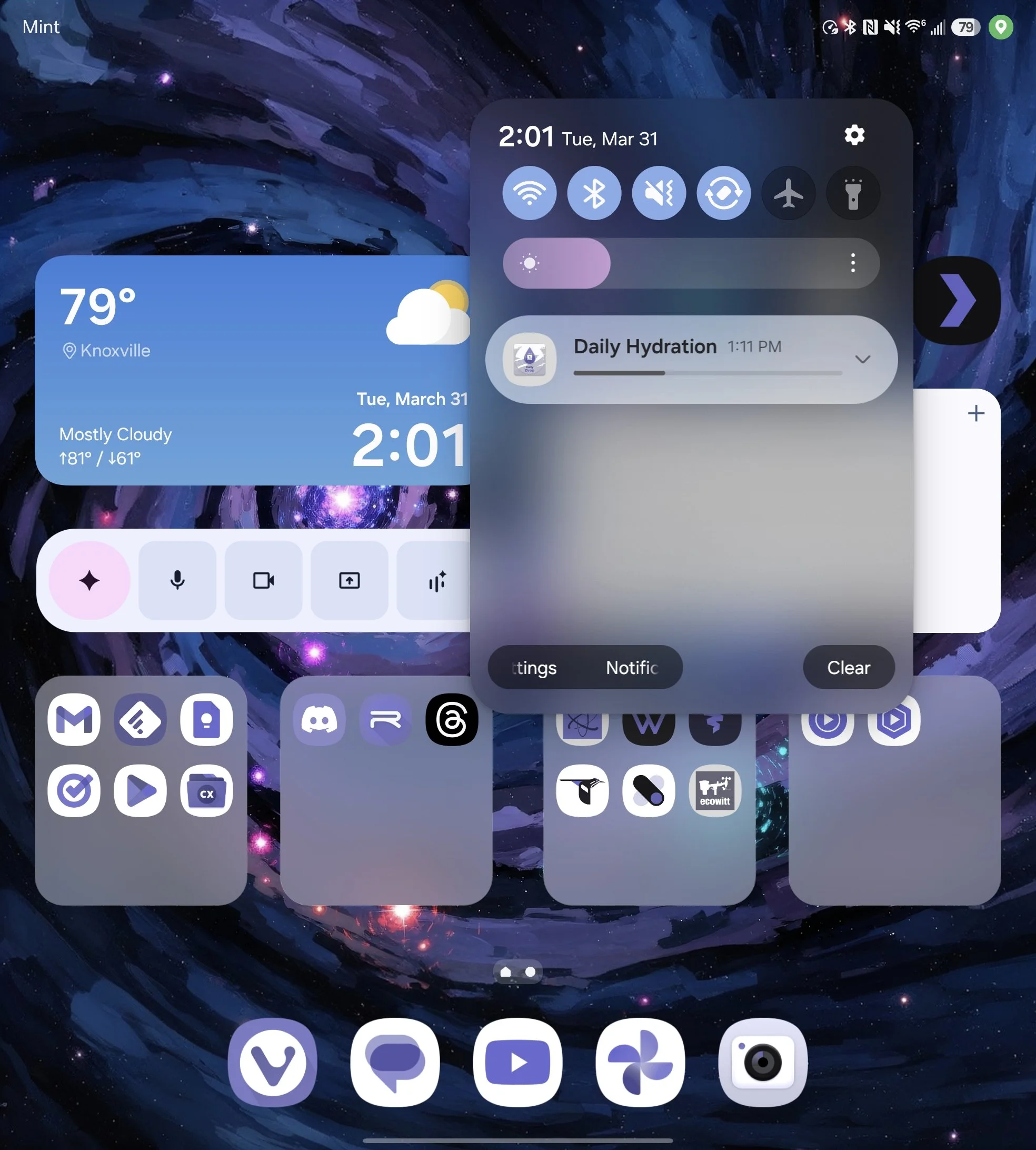
We have to address the elephant in the room from my first impressions of the beta: the new floating window style for the notifications and the Quick Settings panel.
To be honest, I didn't know what to think when I first saw it. Samsung has completely moved away from that anchored, full-width look we’ve been used to for years. Now, everything sits in these rounded "islands" that hover over the interface. On a screen as massive as the Z Fold 7, seeing your notifications and toggles detached from the edges of the display felt jarring at first. It’s a bold departure from the traditional Android aesthetic, and my initial reaction was a mix of curiosity and "Wait, do I actually like this?"
The old style definitely had its issues. On a screen this size, having your notifications or Quick Settings centered with a massive amount of wasted space on either side never felt right. It technically occupied the entire screen, but it did a really poor role of actually using that real estate.
Samsung’s new approach takes a different path by shoving everything into a relatively small floating window, leaving the rest of the display completely unincluded. In a way, it feels like a logical direction to go in—if you aren't going to fill the space, don't pretend to.
That being said, I still think I prefer Google’s approach. They use the entire canvas by splitting the view, putting all your Quick Settings on the left and all your notifications on the right. To me, that feels like actually using the big screen you paid for, whereas Samsung's new style can feel like we're wasting most of it.
However, after spending more time with this beta, I’ve realized I might have been downplaying one major positive that many of you pointed out. If you’re watching video content, you can pull the shade down to check a notification or toggle a setting and still see most of what’s happening in your video. When you’re consuming media, which is arguably a primary reason to use the inner screen, this is a genuine advantage.
While I’d still like to see the whole screen utilized, I’ve definitely gotten used to this. And I have to admit, from a purely aesthetic standpoint, it does look very nice. I’ve heard people mention that this might be better for one-handed use, but this has not been the case for me. I guess the good news is that you probably aren’t using the inner screen with one hand, so I doubt that was ever an intended benefit.
Beyond the layout itself, the customization to the Quick Settings is quite nice. I was able to make something that was slightly tweaked from the default that is already working much better for me. Having the ability to finally resize certain tiles or rearrange the floating blocks means I can put my most-used toggles exactly where my thumb naturally rests on this wider screen.
Another detail that stood out is the elastic notification dismissal. When you swipe a notification away, it has this rubber-band-like stretch before it snaps out of view. It looks very similar to how it is on Pixel devices, almost like Samsung pulled it straight from Google's playbook. If I’m being nitpicky, that specific animation doesn’t necessarily fit perfectly with the rest of the One UI system animations, but it’s a minor point in an otherwise smooth experience.
P.S. it looks like Google might soon be taking Samsung’s approach to large screen notifications. Hopefully Google will see fit to give us a toggle..
UI Tweaks
Moving on to the lock screen, I’ve been really pleased with the new 3D depth clock. It’s impressive how universally the software is able to find something in your wallpaper (whether it’s a person, a pet, or even a building) and wrap the clock around it. It adds a layer of depth that makes the lock screen feel less like a static image and more like a professional layout. It’s one of those "wow" features that actually works as advertised without much fiddling.
The lock screen as a whole just feels significantly more polished in this build. A good example is the new frosted glass look for the PIN pad. When you swipe up to unlock, the number buttons have this translucent effect that blurs your wallpaper with a pop of color behind them. It gives the interface a sense of depth and texture that was missing in previous versions. It is a small detail, but it really ties the whole lock screen experience together. I also like the floating window version of the folder pop-up you can enable in the Home Up module within Good Lock.
DeX Improved
Finally, we have to talk about Samsung DeX. For me, this is where the 8.5 update really shines. The major shift here is that DeX can now finally remember the size, location, and shape of the windows you had open.
This has been a massive game changer for my workflow. I have specific layouts for my productivity apps that I used to have to manually set up every single time I wanted to use my lapdock. Now, I just plug in and everything is exactly where I left it. It takes DeX from feeling like a "mobile desktop mode" to feeling like a legitimate, reliable workstation.
Battery Life
For the battery life section, it is worth noting that things have actually been a little bit worse than normal for me lately. This isn't super crazy for a beta build, as unoptimized background processes and new features like the ambient blur effects usually take a toll on power consumption early on. Still, it is something I have noticed during my daily use. Hopefully, this is something they can iron out and optimize by the time the stable release rolls around.
Wrapping things up, it is important to note that there are still quite a few features that just aren't in this beta yet. Significant updates to Bixby and that new "Now Nudge" feature are still missing from the current builds. I expect those to potentially be functional with the Z Fold 8 launch, or at least closer to the final stable rollout.
For now, though, the One UI 8.5 beta on the Z Fold 7 is stable and smooth. It definitely looks very nice, and the improvements we do have make the device feel more refined. If you can handle a little extra battery drain for a few weeks, it is a fun look at where Samsung is heading.