Pebble Time 2 Review: Perfectly Imperfect
When news broke over a year ago that Pebble would return, it felt surreal given that the original company and ecosystem had long since died. I had always wanted one, so when they announced brand new hardware running PebbleOS, I put my money down on day one. Now, having used the Pebble Time 2 for about a week, I am excited to share my thoughts.
The device features solid, capable hardware, impressive endurance, and a unique transflective display. However, navigating the software highlights significant gaps, including poor notification syncing and the frustrating absence of a dedicated text messaging app. Ultimately, this watch feels like a true passion project for the dedicated enthusiast.
Solid and Capable Hardware
Holding the Pebble Time 2, the device feels pretty good in the hand. The build quality is solid, and there aren't any glaring hardware defects. Given that this is a low-volume product and not something backed by the massive corporate manufacturing scale of an Apple Watch, it holds up well and feels sturdy enough for daily wear. It even comes with a 3 ATM water resistance rating, meaning it is perfectly fine for handling rain, washing your hands, or a quick shower.
The display itself looks nice, crisp, and clear. Even more surprisingly, the UI animations look a lot nicer and more fluid than you would typically expect from a low-power display.
That fluidity comes down to the underlying tech. While the display is frequently marketed under the broad umbrella term of "e-paper," it is absolutely not a true E-Ink screen like you find on an Amazon Kindle. True E-Ink works by physically shifting micro-capsules of charged pigment particles, resulting in a sluggish refresh rate that makes animations impossible and causes heavy ghosting.
Instead, the Pebble utilizes a specialized, transflective Memory LCD manufactured by Sharp. This technology features a tiny SRAM memory cell embedded directly into every single pixel on the panel. Because each pixel can actively remember its own state, the display only draws power when a pixel needs to change. This gives you the extreme battery efficiency of e-paper while allowing for instantaneous menu scrolling and smooth animations with zero ghosting. The panel relies on a reflective backing to bounce ambient light through the screen, making it incredibly legible in bright sunlight.
Taming the Backlight and Wrist Flick Gestures
Living with this display indoors means dealing with Pebble's automatic lighting logic, which relies on a combination of an ambient light sensor and a dynamic backlight setting. In theory, the ambient sensor detects when you are outside or under bright lights and keeps the backlight completely off to save juice, since the reflective screen thrives in bright environments. When you move indoors, the dynamic backlight is supposed to intelligently step in and provide just enough illumination to match your surroundings. In practice, it is a bit of a mixed bag. The watch tends to lean on the conservative side, and I frequently found the screen looking a bit too dim for comfort in low-light rooms.
Compounding this is the "wake on motion" feature, which is supposed to illuminate the screen with a simple flick of your wrist. Out of the box, the sensitivity is frustratingly low, often leaving you awkwardly shaking your arm or resorting to a button press just to see the time.
Fortunately, there is a hidden way to fix this if you are willing to dive into the software. If you head into the smartphone app, navigate to the phone settings, and scroll all the way down, you can activate a hidden "Debug" menu. Once those developer options are toggled on, a new motion sensitivity menu unlocks under your display settings. Cranking this up to medium-high completely changes the experience, making the wrist gesture feel incredibly responsive. Just keep in mind that the more responsive your wrist flick is, the more often that backlight turns on, which will definitely eat into your total battery life.
Sticky Interface Utility and Music Control
The software handles interface navigation with an intentional quirk that actually turns out to be an excellent usability feature: the screen completely lacks an automatic timeout. On almost any other smartwatch, if you interact with an app and then drop your wrist, the software will aggressively snap back to the primary watch face after a few seconds. The Pebble Time 2 doesn't do that. It stays indefinitely on whatever interface or menu you last left open.
While that might sound minor, it is incredibly convenient in practice, especially for media control. If you open up the music app on the watch while putting in your earbuds for a walk, the watch stays locked onto that screen. You can glance down, skip tracks, tweak the volume, or pause a podcast seamlessly throughout your entire session without having to constantly dig back through menus or navigate away from the clock face over and over again. It simply behaves like a dedicated remote control on your wrist until you manually decide to push a button and exit.
Tactile Navigation and Custom Button Shortcuts


Getting back to your preferred app isn't a chore anyway because the entire interface relies on physical buttons that you can fully customize. The watch features a dedicated back button on the left, alongside up, select, and down buttons on the right. You can program a press-and-hold action for almost every one of them to launch specific apps or functions instantly from your main watch face.
The level of personalization here is fantastic, and it makes moving through the OS incredibly efficient. For my setup, I mapped the music and media controls to a long-press of the up button, allowing me to pull up my remote audio interface instantly. Holding the down button pulls up my full notification history. For the back button on the left side, a long-press toggles "Quiet Time." This is perfect for heading to bed, as it completely silences vibrations and stops the backlight from accidentally turning on when you roll over in your sleep. Having that level of tactile control without ever needing to look at a touch screen is a massive win.
Interestingly, the Time 2 does have a touchscreen and I’m sure there are apps that use it, but PebbleOS itself really just.. doesn’t. You can tap the screen to wake the backlight, but that’s about it. Everything is done with those 4 buttons, which takes a bit of getting used to. That being said, the tactility has allowed me to very quickly learn to play/pause or skip a track without ever even looking at my screen. Just feeling the buttons.
Real-World Battery Life vs. The Marketing Claims
One of the primary selling points of the Pebble lineup has always been the legendary endurance, and the marketing for the Pebble Time 2 leans heavily into that legacy, officially quoting a massive 30-day battery life. However, out in the wild, the current state of the software paints a slightly different, though still incredibly impressive, picture. The company has explicitly stated that while the underlying hardware is fully capable of hitting that four-week target, early software optimizations mean real-world users are currently averaging closer to 14 days.
Based on my first few days of continuous wear, that 14-day estimate is exactly what the watch is trending toward. If you break down the percentage drop over a multi-day span, the math puts the consumption rate right around 7% per day. If you project that pace out over a full cycle from a 100% charge, you are looking at a very reliable two weeks of regular use before needing to clip on the magnetic charging cable.
While that might fall short of the theoretical 30-day marketing promise for now, a fortnight of real-world endurance with an always-on display absolutely demolishes mainstream competitors like the Apple Watch or Pixel Watch, which still require a daily visit to the charger.
The Empty Timeline Experiment
Alongside the hardware, one of Pebble's most distinct software features from back in the day was the timeline concept, a chronological feed meant to pin your past, present, and future events directly to button presses. In practice with this new model, it just has not been a factor for me at all. I rarely find myself using it.
The core issue is that the timeline's usefulness relies entirely on an active ecosystem pushing data to your wrist. For now, it stays mostly empty and underutilized. Down the line, as the platform matures, more developers jump on board, and more functional apps pop up, the timeline might become a crucial part of the daily routine. For now, it is just a neat idea waiting for content.
App Store Hurdles and Google Integration

Trying to find those functional apps to populate the timeline brings you directly to the Pebble app store, which is an experience in itself. The digital storefront is a massive, jumbled repository of the old and the new, though it leans heavily toward the old. Navigating it is a bit like digital archaeology; you will run into an overwhelming number of options, but a significant portion of them are outdated, abandoned, or completely broken. It is definitely not user-friendly, and it requires a specific kind of nerdy patience to dig through these old archives and figure out clever workarounds just to get things running.
If you are hoping for seamless out-of-the-box synergy with modern ecosystem services, you will need to adjust your expectations. Finding working Google integrations is incredibly rare. I spent some time specifically looking for a Google Keep client to sync my notes and lists, but I haven't been able to find a single one that actually works correctly. There is a Google Tasks app available, but the setup process highlights the platform's clunky nature. Instead of a quick sign-in button, you have to manually copy an authentication link, grant permissions on your phone, copy a long string of text, and then paste that code back into the watch app settings. It is a far cry from the effortless, polished setup of Wear OS, making the watch best suited for people who actively enjoy the process of tinkering.
Endless Watch Face Customization
Where the app ecosystem requires a lot of filtering to find gold, the watch face ecosystem is an absolute home run. The platform offers an innumerable number of watch faces to choose from, giving you virtually endless customization options right out of the gate. It is honestly difficult to think of a random theme, aesthetic, or keyword that you can type into the app store search bar and not find at least one matching watch face for. Whether you want something ultra-minimalist, a face packed with data complications, or a retro aesthetic to match the hardware, the sheer volume of working, creative designs ensures you will easily find something that fits your style.
The Message Lock-In and Notification Friction
For all the things the software handles gracefully, it hits a massive roadblock when it comes to communication: the complete omission of a dedicated text messaging app. If you owned a Pebble back in the day, you probably remember the handy "Send Text" app that let you browse a list of favorite contacts and proactively spark a conversation straight from your wrist. With the current firmware, that app is completely gone.
To make matters worse, there is currently no way to view your text message history. When I noticed this, I checked the official documentation, which notes they haven't even started rebuilding the Send Text app for this platform yet. I actually reached out to Eric Migicovsky on Twitter to see if there was any light at the end of the tunnel, and he confirmed that there is currently no timeline for its return.
What this means for the daily experience is a massive bottleneck: the only way to send a text from the watch is to interact with an incoming notification the exact second it hits your wrist. You get one solitary shot at it.
When that alert pops up, you can fire back with pre-saved canned responses, emojis, or use voice typing. The voice dictation here is excellent. You can just talk completely naturally and the watch intelligently inputs the proper punctuation for you on the fly. It is so good, and works so seamlessly, that it makes the lack of a proper messaging app feel even more frustrating. It leaves you constantly wishing you could use that stellar voice typing to actually initiate a text conversation whenever you want rather than waiting around for a notification to land.
This brings us directly into the weirdly isolated world of Pebble’s one-way notification syncing. If you manage your incoming alerts directly from your wrist, the watch is actually incredibly capable. You can take actionable steps that successfully sync upward to your phone, such as deleting an email, replying to a text message using voice dictation, or marking a reminder as done.
However, doing that does not clear the notification from your watch. Clearing the notification from your phone also doesn't clear it from your watch. So if you get a notification, you interact with it on your watch, you mark it as read, you reply, or you delete it, whatever it might be, that notification will still be present on your watch until you manually clear it. Crucially, once a notification is cleared from the phone, those lingering alerts on your wrist become completely read-only. You lose the ability to use any of the quick actions or voice replies, leaving you with a dead notification that can only be cleared out by scrolling to the end and hitting "dismiss all." It creates a clunky, disjointed friction that you constantly have to manage if you use your phone and your watch in tandem throughout the day.
Basic Fitness Tracking and Core Biometrics
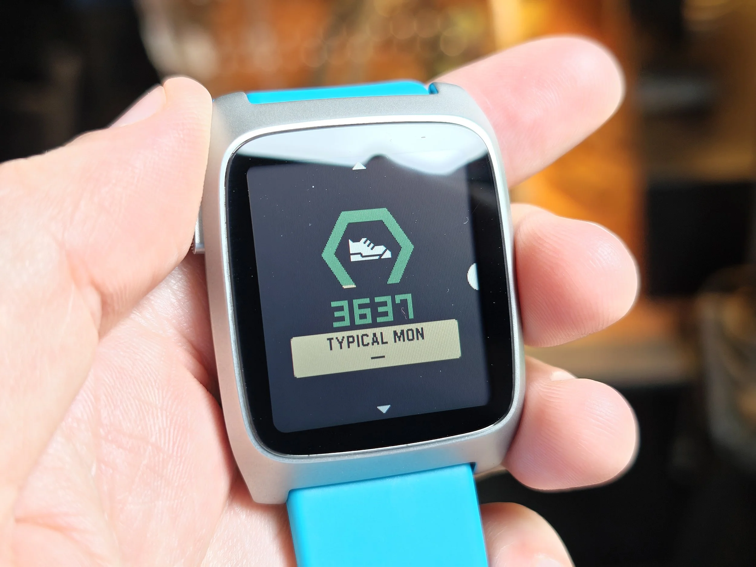

Shifting focus over to the fitness side of things, Pebble Health approaches tracking with a very simple, no-frills philosophy. If you are coming from a modern smartwatch expecting dense biometric analysis, workout profiles, or intense training metrics, you will want to temper your expectations. The platform keeps things basic and focused, laying out your daily activity across a clean, card-based interface in the smartphone companion app.
When it comes to step tracking accuracy, the hardware does a decent job for the average user, though it operates with a slight variance compared to modern dedicated fitness trackers. In a short, isolated 100-step test, the Pebble logged 108 steps while a Fitbit Air recorded 105, showing that both devices tend to slightly overcount on brief walks. Over the course of a fairly light activity day, that gap widens a bit more; the Pebble captured 8,248 steps on a day where the Fitbit Air tracked 9,480. While the modern Fitbit is likely the more precise device over long distances, the Pebble remains consistent enough day-to-day to give you a reliable baseline of your overall activity, cleanly charting out your active peaks, distance covered, calories, and active time.
The layout also features cards for tracking your sleep and monitoring your heart rate, which follow a similarly basic philosophy. The built-in heart rate monitor is set to a passive sampling rate of every 10 minutes at the most to preserve battery life. However, it will automatically switch into a continuous tracking mode the moment it detects that you are out for a dedicated walk or a run.
It is important to note that this automatic background recognition is the extent of the workout tracking on this device. You cannot go into a menu and manually tell the watch that you are about to run on a treadmill, go boxing, or start a specific workout routine. The system simply realizes on its own that you are doing some kind of physical activity, kicks the heart rate sensor into that higher monitoring frequency, and that is pretty much it. While that real-time tracking is great for automatically catching your daily walks, you should expect it to noticeably accelerate your battery drain while active.
Sleep tracking is also fully automatic and behaves decently enough for keeping tabs on your nightly rest. The catch is that it is nowhere near as granular or detailed as what you will find on competing smartwatches. The software really just breaks your night down into basic light sleep and deep sleep cycles. If you are looking to track REM cycles or dive into complicated biometric sleep scores, you won't find that here. It is strictly a straightforward snapshot of your basic resting patterns.
If you have zero interest in any of this data, Pebble makes it incredibly easy to opt out. There is literally a simple toggle in the settings menu to enable or disable health tracking entirely. Flipping that off shuts down the sensors and frees up the software footprint completely. However, if you want fitness metrics but aren't crazy about the stock experience, the Pebble app store already has a handful of third-party health tracking apps available, with the potential for more to show up as developers continue to support the watch. These alternative apps can track your activity differently or surface alternative metrics that might fit your lifestyle better. Just keep in mind that if you do stray from the stock setup, the built-in health suite is always going to be the absolute best option when it comes to seamless integration with the official mobile companion app.
A True Passion Project
It is incredibly difficult to think of another mass-produced consumer device that feels more like a passion project than this watch. The entire experience feels like a dedicated individual simply decided they wanted to build their own perfect smartwatch and actually went out and did it. Crucially, this does not mean the hardware feels poorly made or cheap. The build quality is solid, but the device completely lacks the corporate, sterilized polish of a Pixel Watch or an Apple Watch. It is not trying to compete on those terms, resulting in an end product that feels like something completely and entirely different.
At this point, I fully intend to continue wearing this thing for the foreseeable future. I have really enjoyed my time with it, and it has been a blast to use daily. It absolutely has some rough edges, and there are some clear warts. Most notably, I desperately need to be able to see my text messages and text history in a stable, built-in application. But even with those flaws, this is an absolute tinkerer's dream device. It is going to be so much fun to just watch this platform grow and evolve over time.